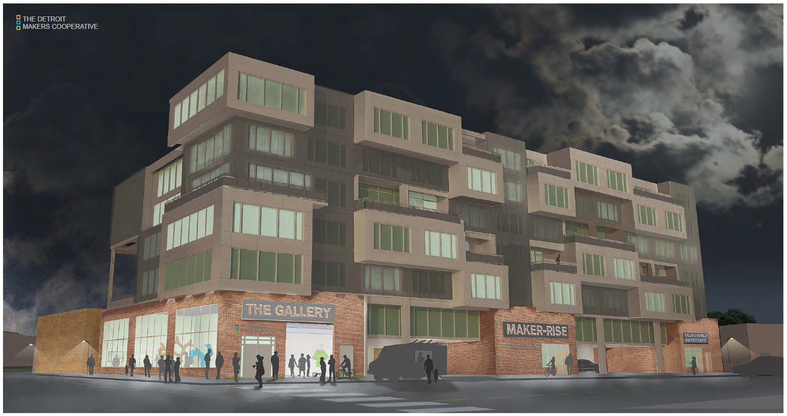
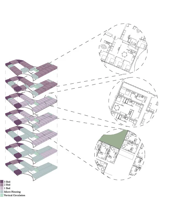
Design Concept
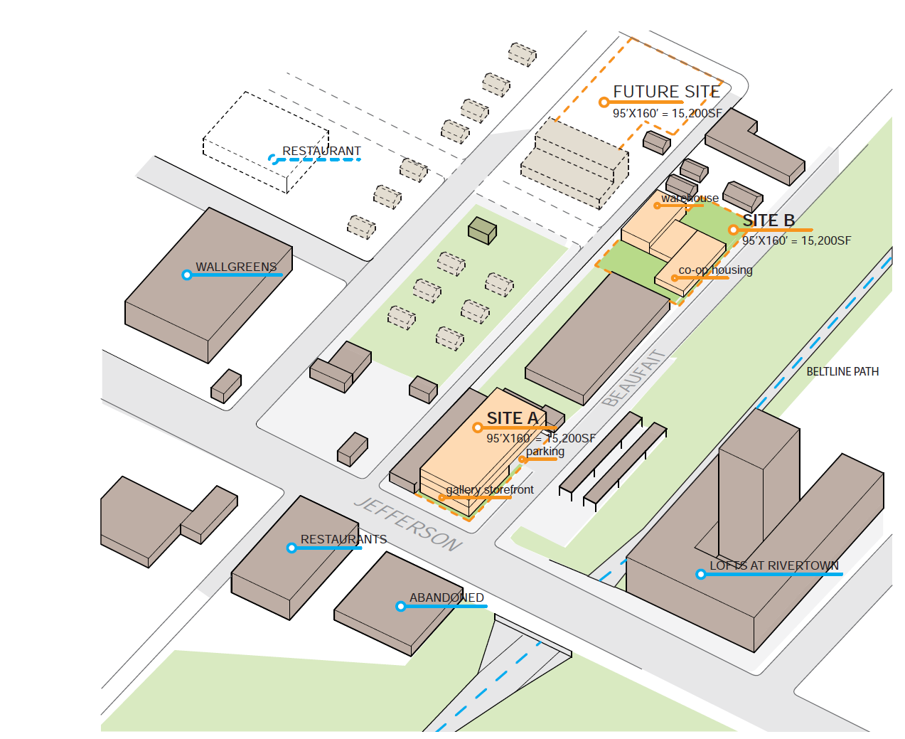
The Detroit Makers Cooperative is a place for makers to live with a community of makers. By bringing makers back into the now seemingly vacant neighborhood of the beltline (an area in Detroit with a maker history), the area is prompted to flourish again with city life.
Inspriation
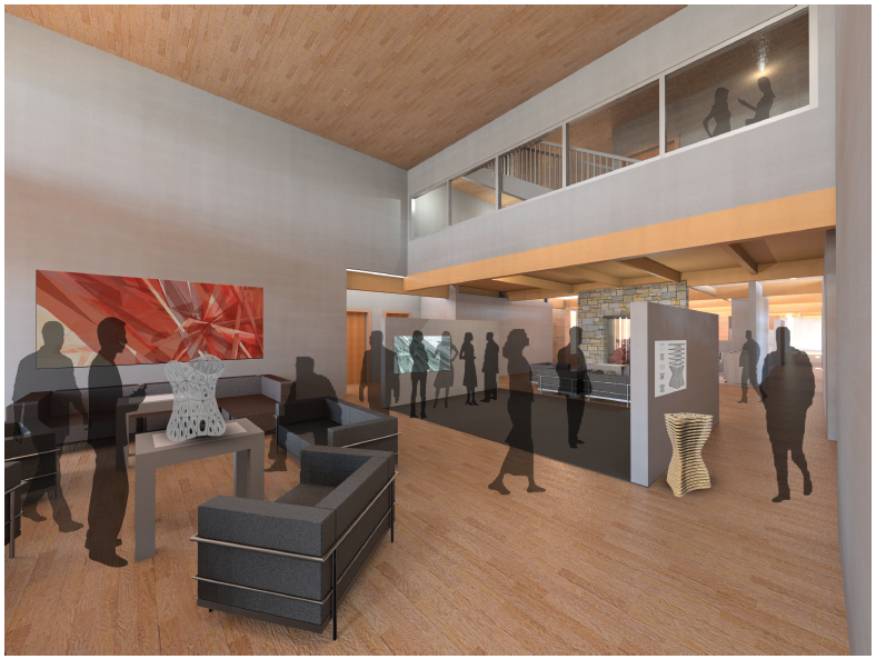
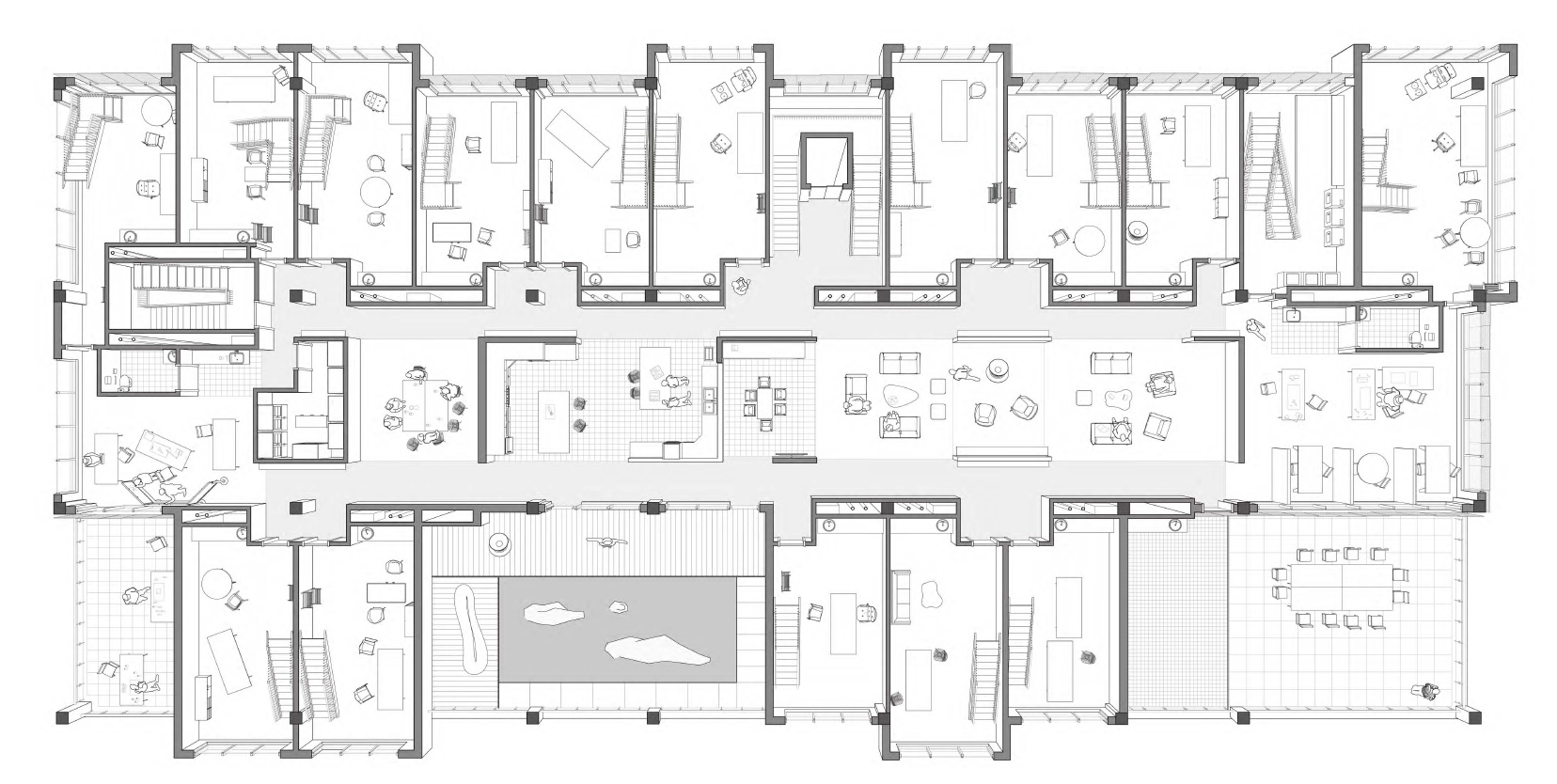
The Cooperative pulls inspriation from Nest, a cooperative for entrepreneurs in Copenhagen. At Nest, residents with entrepreneurial ambitions apply to live in one of 20 bedrooms, but share bathrooms, kitchens, and common space. This allows residents to share ideas and resources while socializing and living in community.
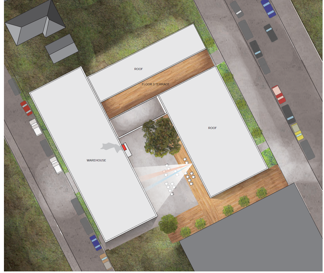
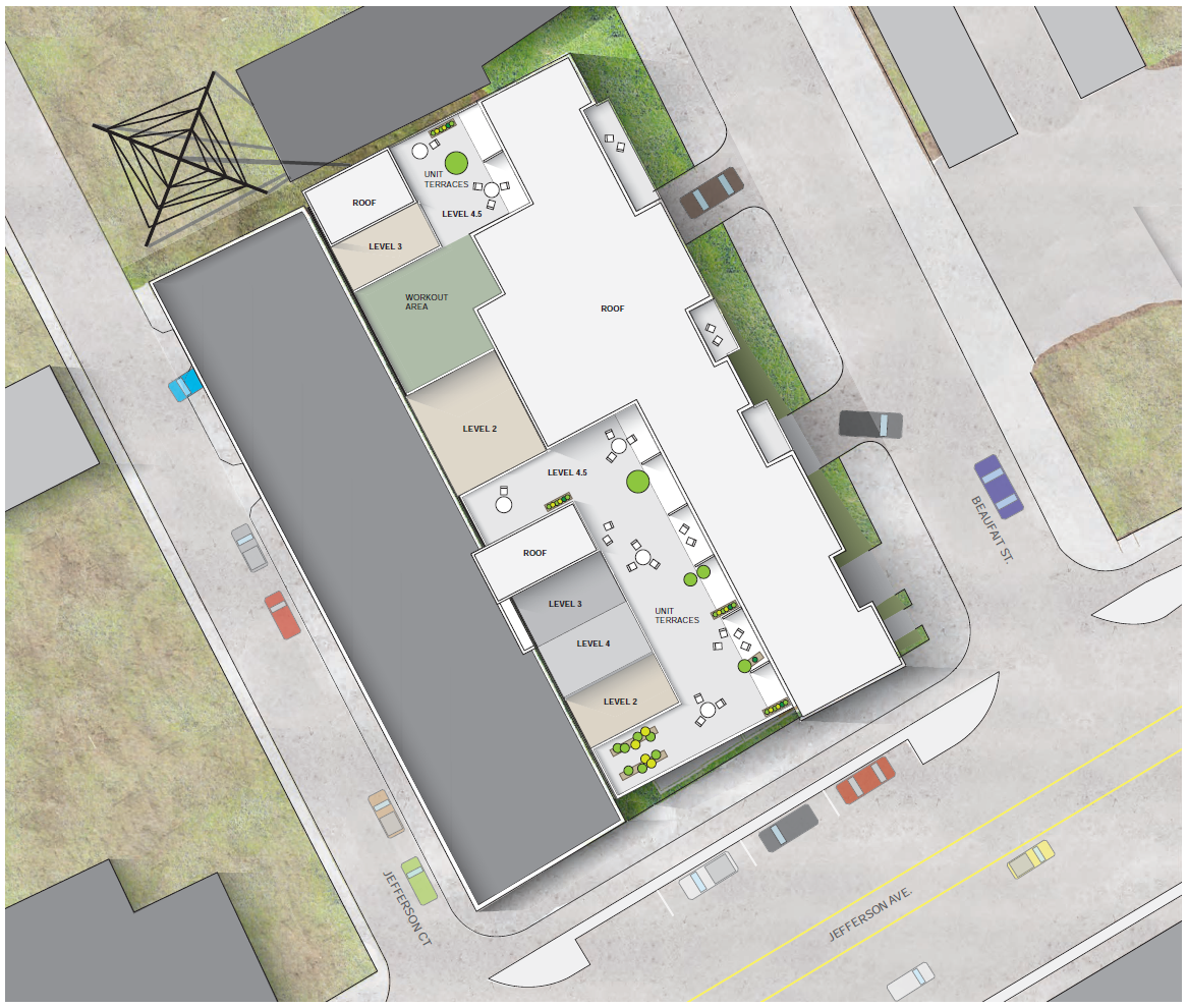
At the Makers Cooperative, resident makers have a similar experience. Each unit has a loft bedroom and bathroom with an entry level maker space for private space, but lead out to shared living, cooking, dining, and working spaces. Also, the makers have access to resource rooms (such as a library and warehouse workshop) and their makings go on display in the gallery which sits at the corner of Jefferson and Beaufait as part of Site A.
Advisor : Kit McCullough
Group Members: Stephanie Bunt, Rachael Henry, Shujie Xie
Completed: Second Year, First Semester (Fall 2017)
School: University of Michigan
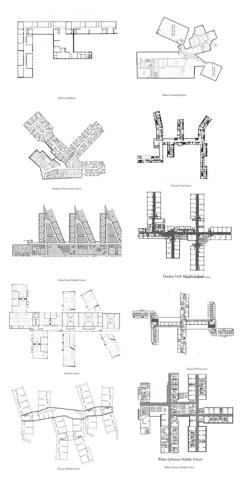
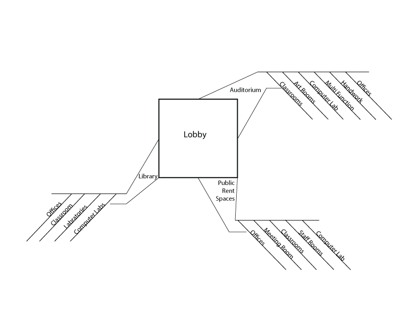
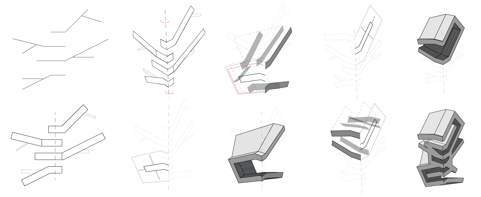
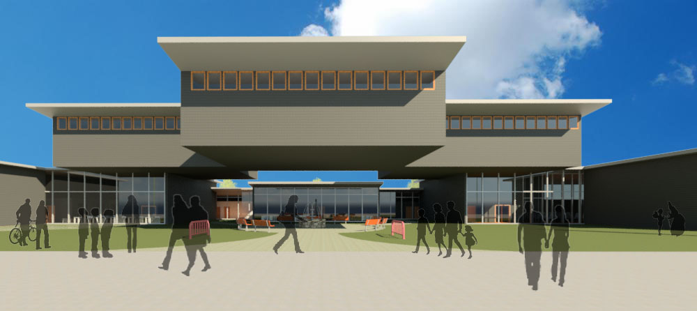
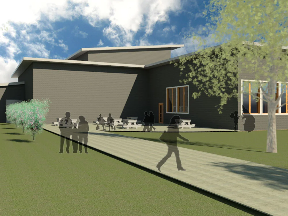
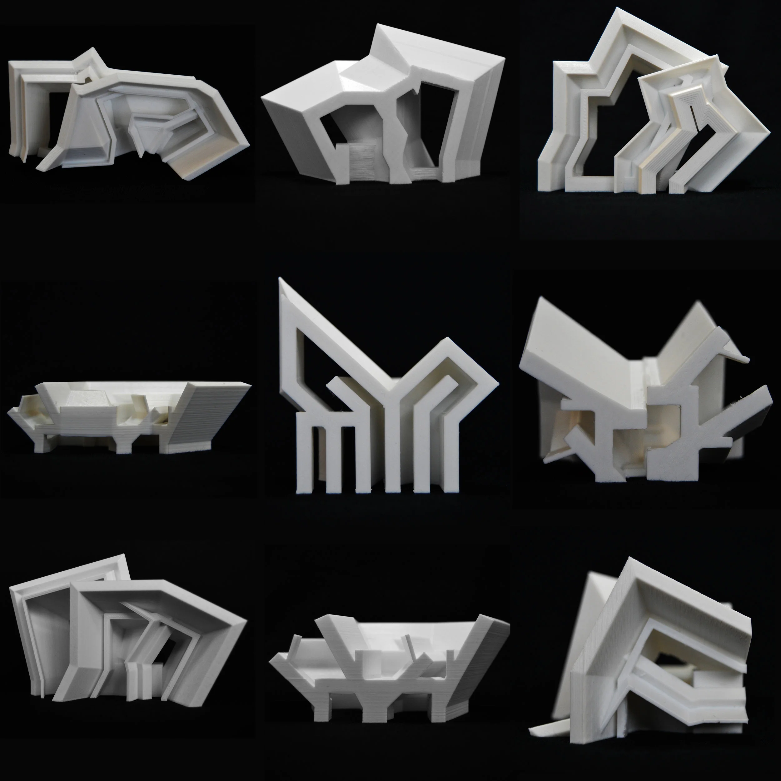
Typo examines differences in the typology of middle school buildings. This particular study focuses on breaking down middle schools that follow the appendage typology. This study started with analyzing the typology and breaking it down into a root form. Not only did the study of appendages lead to a form for the building, but also a pedagogy was developed based around the design of the school. The design focused on the connections of the appendages and so the school would focus on collaborative spaces within for the students instead of traditional classrooms.
Advisor: Michael Jefferson
Year Completed: First year, First semester of Graduate School (Fall, 2016)
School: University of Michigan
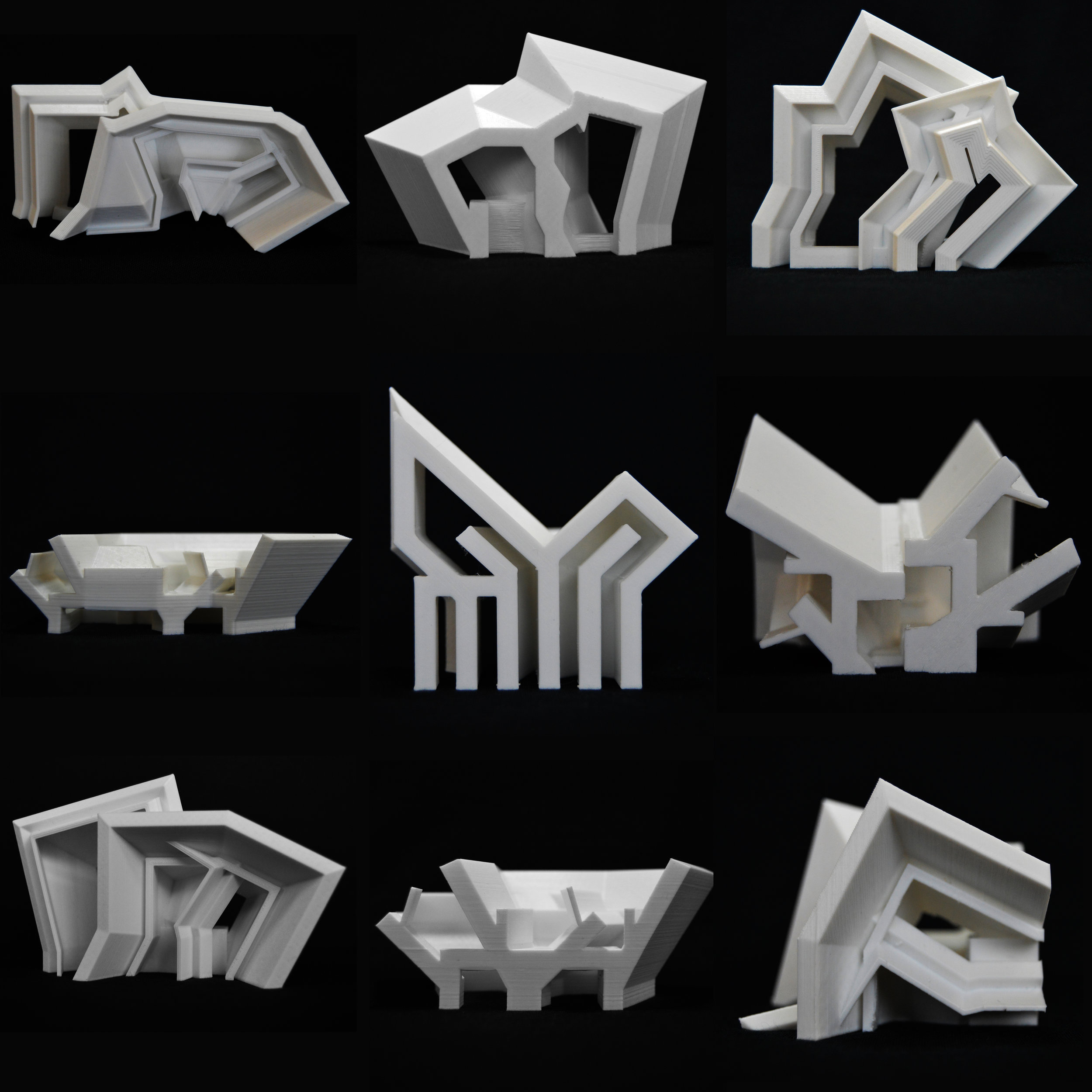
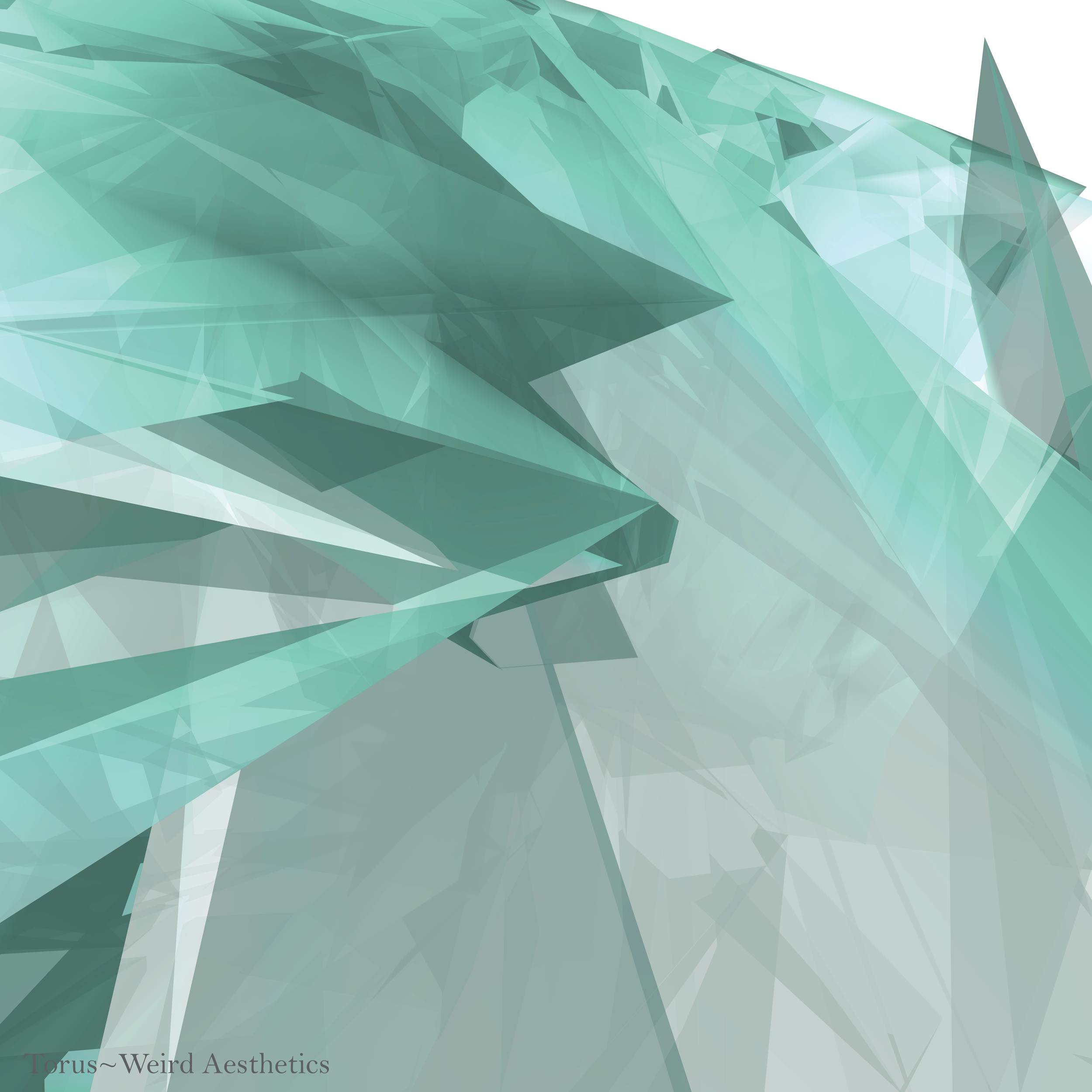
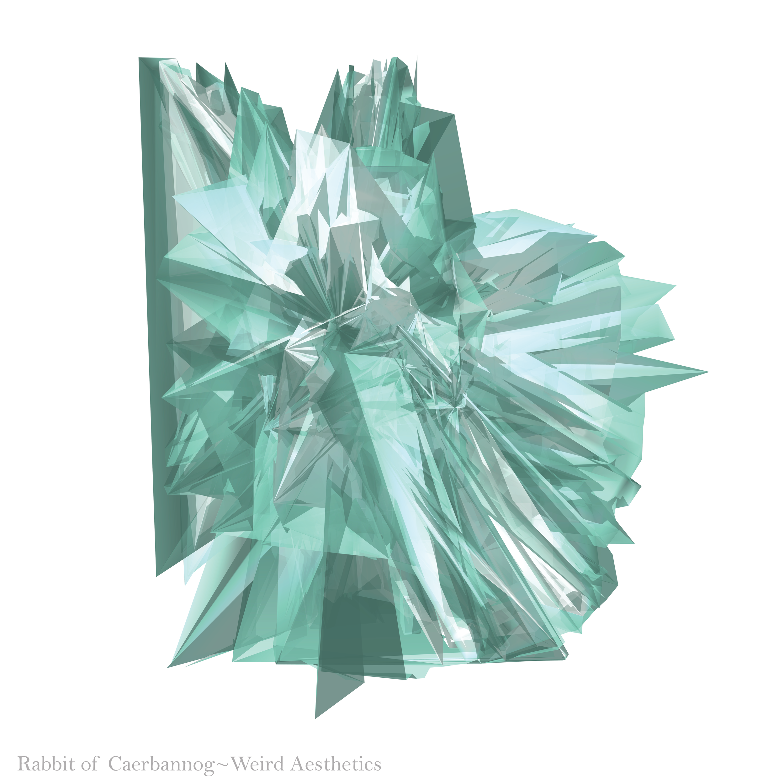
Weird Aesthetics addresses the concept of ruination through the exploration of altering familiar
typologies. Some of these typologies include primitive forms, familiar objects, and familiar tools. Weird Aesthetics focuses on tool used in design and representation, and breaking those tools to obtain an unexpected results. These were done by editing OBJ code files, either adding, or subtracting lines of code.
Advisor: James Kerestes
Year completed: Second Semester, Fourth Year (Spring 2016)
School: Ball State University
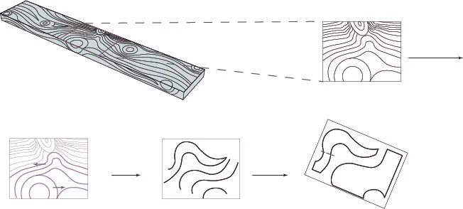
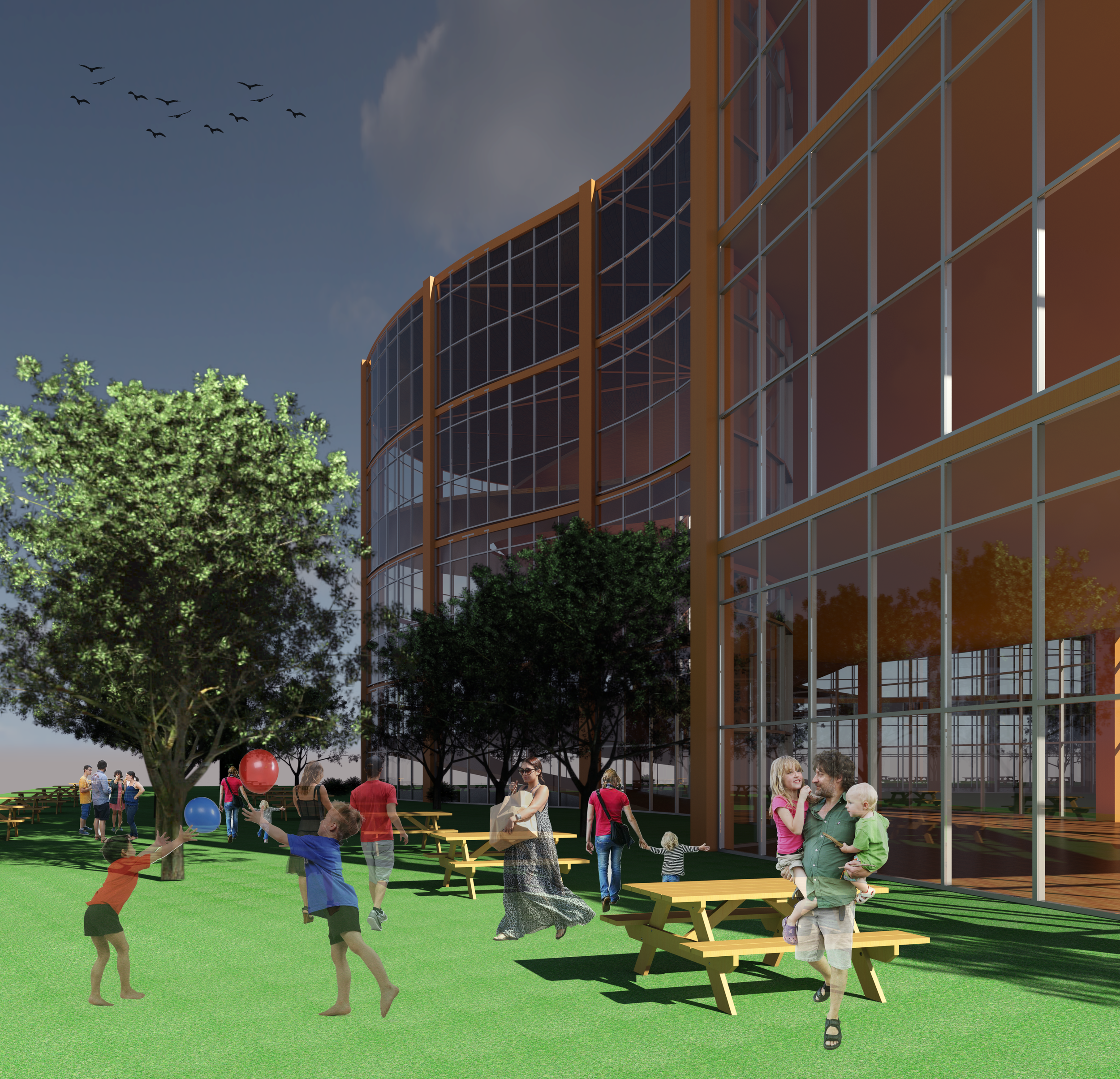
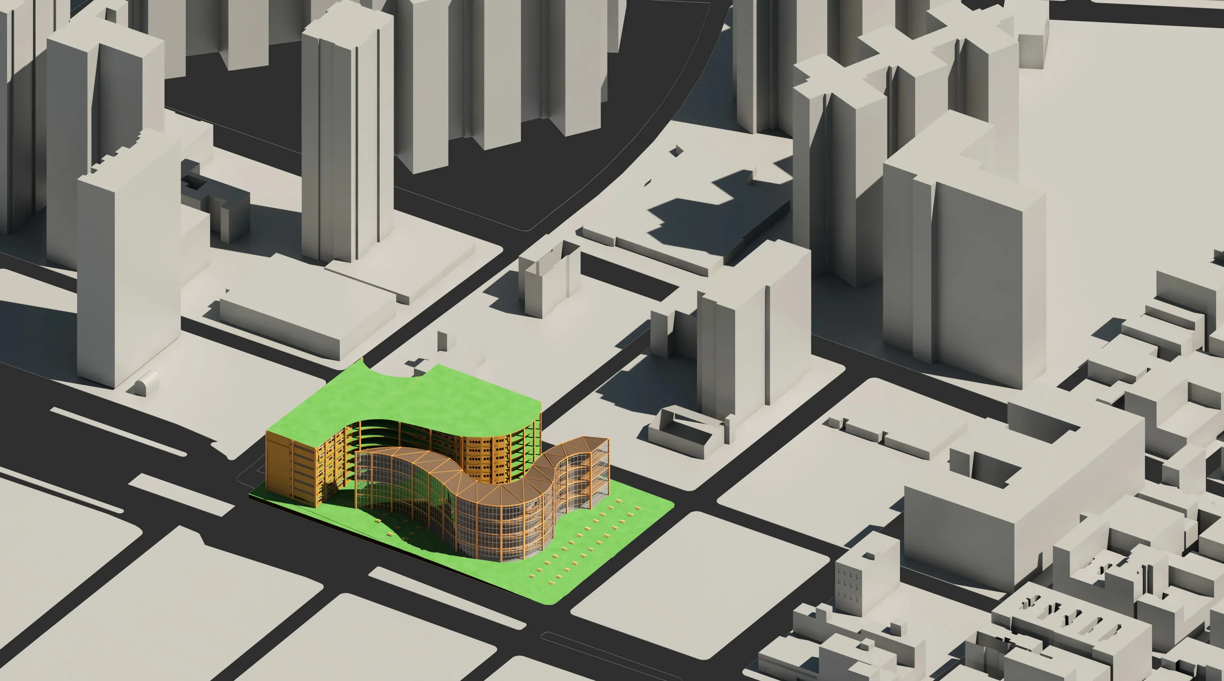
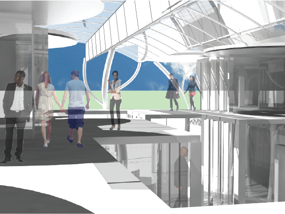
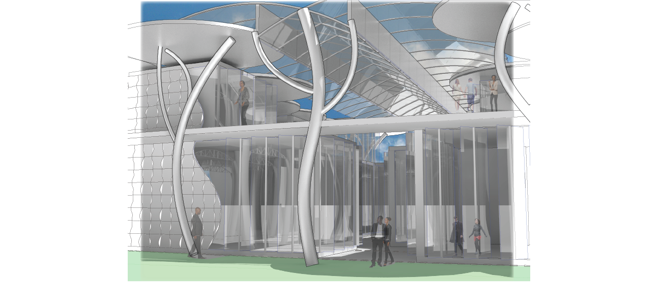
This project prompt was entitled Timber in the City. The goal was to design a structure in New York City using timber. The prompt included a proposal for a new Essex street market, a new Andy Warhol museum and low-income housing. The programs are split between two buildings, with the street market and the museum in one and the residences in the other. There is a walking path between to allow for a visual separation between the public and private aspects of the site but allows the people living in the housing block a spot to come together with the people visiting the market and museum.
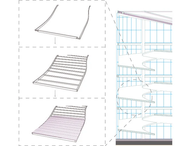
Because one of the challenges was to find a way to bring timber into every aspect of the design, I decided to pull the form of this building from wood grain. The knots in the wood became public areas, given either to the city or the residents living in the low-income housing. The permanent stalls of the street market are placed on the first floor of the first building while other stalls can be set up out on the site and changed regularly or as needed. The museum is designed to have a continuous circulation space in the middle, made mostly of two ramps, where much of the artwork can be stored and seen. Each end of the museum however is level and has movable partitions where the more sensitive artwork can be seen and stored.
Programs Used: Revit, Rhino, Adobe Illustrator, and Adobe Photoshop
Advisor: Michele Chiuini
Year Completed: First Semester, Fourth Year (Fall 2015)
School: Ball State University
The goal for this project was to design a Library based in the city of New Orleans. New Orleans is very well known for many different aspects of its culture. Most specifically it is known for its entertainment, such as the music, its food, and it’s many celebrations. All of these aspects of New Orleans work to bring the population together. Bringing people together around food and music is an essential aspect of the New Orleans culture. This idea is how I came up with the form of the building. Along with their culture, New Orleans is also famous for Oak Alley Plantations, and their Southern Plantation style homes. Both of these are almost exclusively found in New Orleans. This style of the Southern Plantation homes and the feeling of walking through an alley of trees is what I tried to emulate in the initial view and the façade of this library.
The form of the building was chosen to resemble a group of people gathered at a table of food and facing some form of entertainment. This form was then stepped in order to create movement in the main pathway, and areas for people to gather either publicly or privately. The entire area is open with glass panels for entrances, and ventilation of the building. However, the reading areas, offices, and collections are all climate controlled only putting about a quarter of the building in need of heating or cooling. The tops of the “trees” provide shade for most of the building that is outside. Including the balcony that circles the second level. Hanging underneath the glass canopy are sheets of metal that act as heat sinks when the sun hits them, drawing the heat from lower levels up and out of the interior and blocking the sun from the interior as well.
Programs Used: Rhino, Photoshop, Illustrator
Completed: Second Semester, Third Year (Spring 2015)
Advisor: Robert Koester
School: Ball State University
This project is a green energy workforce training center. The site is across from the Indianapolis Children’s Museum in Downtown Indiana. This training center has classrooms, libraries and computer labs both for learning and for employment help as well as display space and lounge areas. The theme to my design is modules. The same form is used throughout the site as a continuation of that theme. This center is focused on having a net zero energy cost. As such, southern light is very important for passive solar energy. It is important for heat gain during the winter, yet it is also important to keep the southern light off of the building during the summer to avoid too much heat gain. This lead to the slanted roof idea for the individual modules. Each module has a full wall of south facing glass for full winter exposure, yet has an overhang that keeps much of the summer sun off the glass. The second story also helps to keep the summer sun off of the first floor. These slanting roofs also allow for greywater collection for use in the building. Structure for this building is steel space frames which also allows for the modularity of the building to continue. Along with steel, this building also uses glass, acoustic panels, and wood panels as an interior finish. The acoustic panels are used to control light inside the building and to hide ducts from visitors.
Programs Used: Revit, Rhinoceros, V-Ray (Rendering in Rhino), Illustrator, and Photoshop
Completed Second Semester, Third Year (Spring 2015)
Advisor: Robert Koester
School: Ball State University
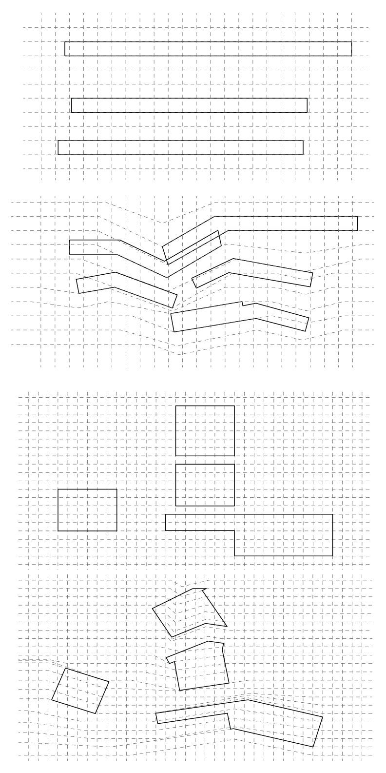
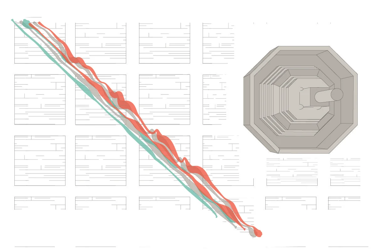
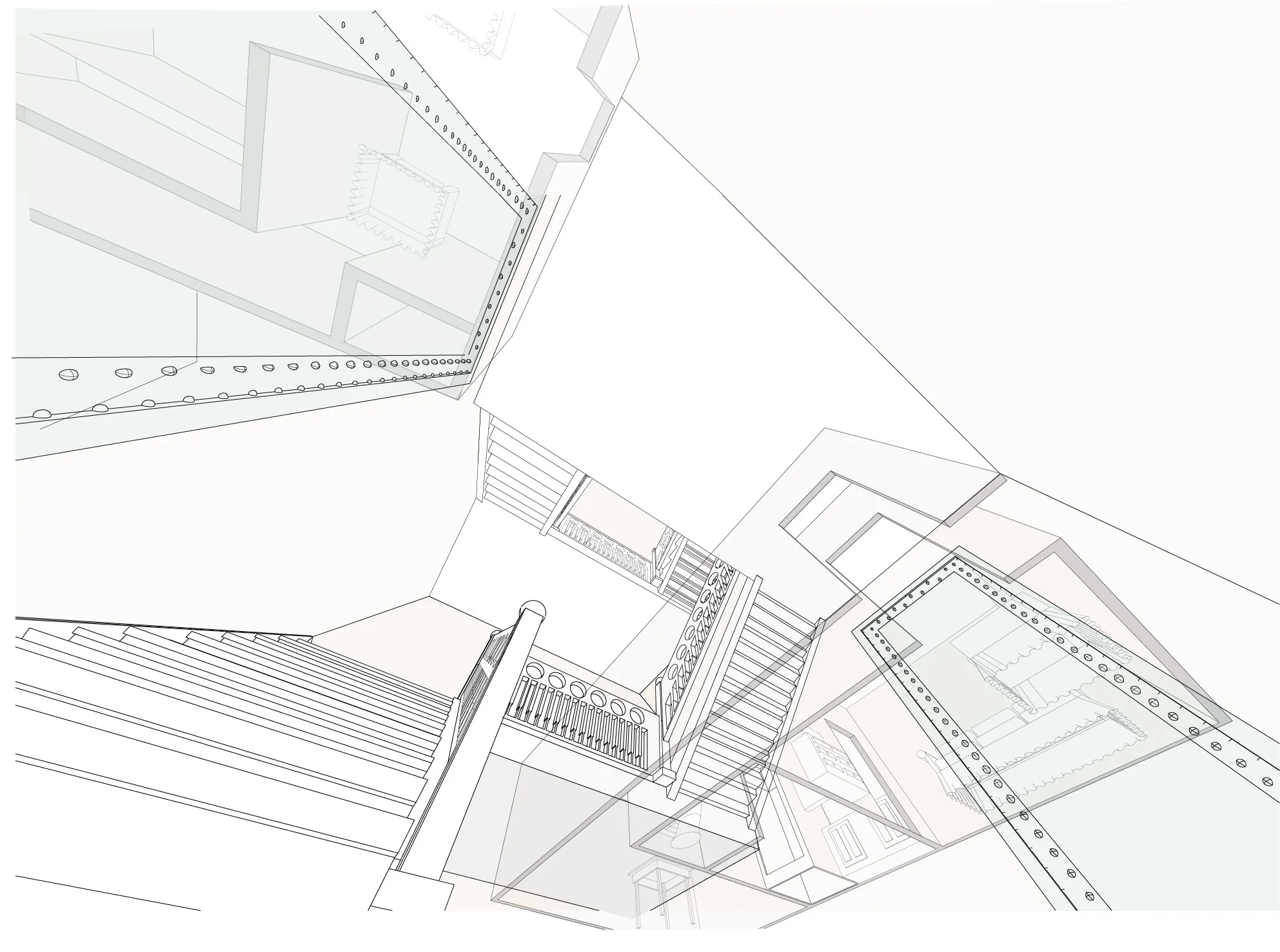
The challenge for this project was to diagram scenes in the movie Run Lola Run. The first diagram we did was diagraming the entire movie and how the other characters in the movie affected Lola. The second diagram is showing the movement of Lola as she runs through a courtyard. The last diagram is looking up the stairs that Lola just ran down and the rooms that she ran past.
Group Member: Rachael Henry, Johanna Thomas, Zack Kaiser
Programs Used: Rhino, and Illustrator
Completed Second Semester, Second Year (Spring 2014)
Advisor: Andrew Wit
School: Ball State University